To celebrate their 50th Anniversary, Starbucks wanted to think of a new, consolidated way to tell their story. Part of the strategic plan defined with Second Story was to create an online archive to tell this narrative, one bite at a time.
Art DirectionUI/UX Design
Motion Design
Production Design 2018 · With Second Story† →
Home Page.
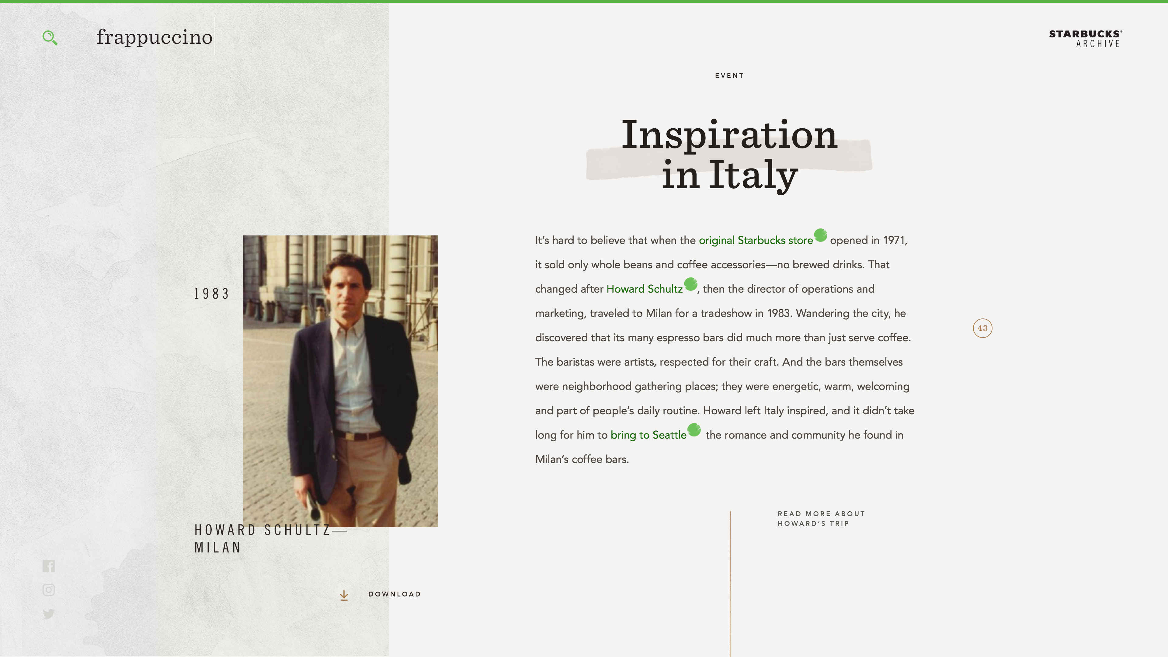
Instead of telling the story of Starbucks in a long chronological way, shorter, specific stories can be browsed in a more digestible form. Each story connects to a few others and the visitor can bring the puzzle pieces together a la wiki.
This content structure was a strategic answer to their ask: how to tell a story of 50 years, when the original information and memory can be so sparse? We concluded it was best to embrace the fact that it would take a significant effort to gather all the data to release an exhaustive story. By writing short stories and connecting them, we were able to bring the focus to a few dozen major stories, and allowed the brand to keep writing new ones and connect them to the existing ones at their own pace.
We created a working prototype, including an actual CMS, transitions and animations, to demonstrate the potential of the Archive.
Story Page.
Motion Studies.
As Starbucks was in the process of finalizing brand guidelines over the course of the project, the art direction went through many changes, from original visual explorations to the very last weeks of the project.
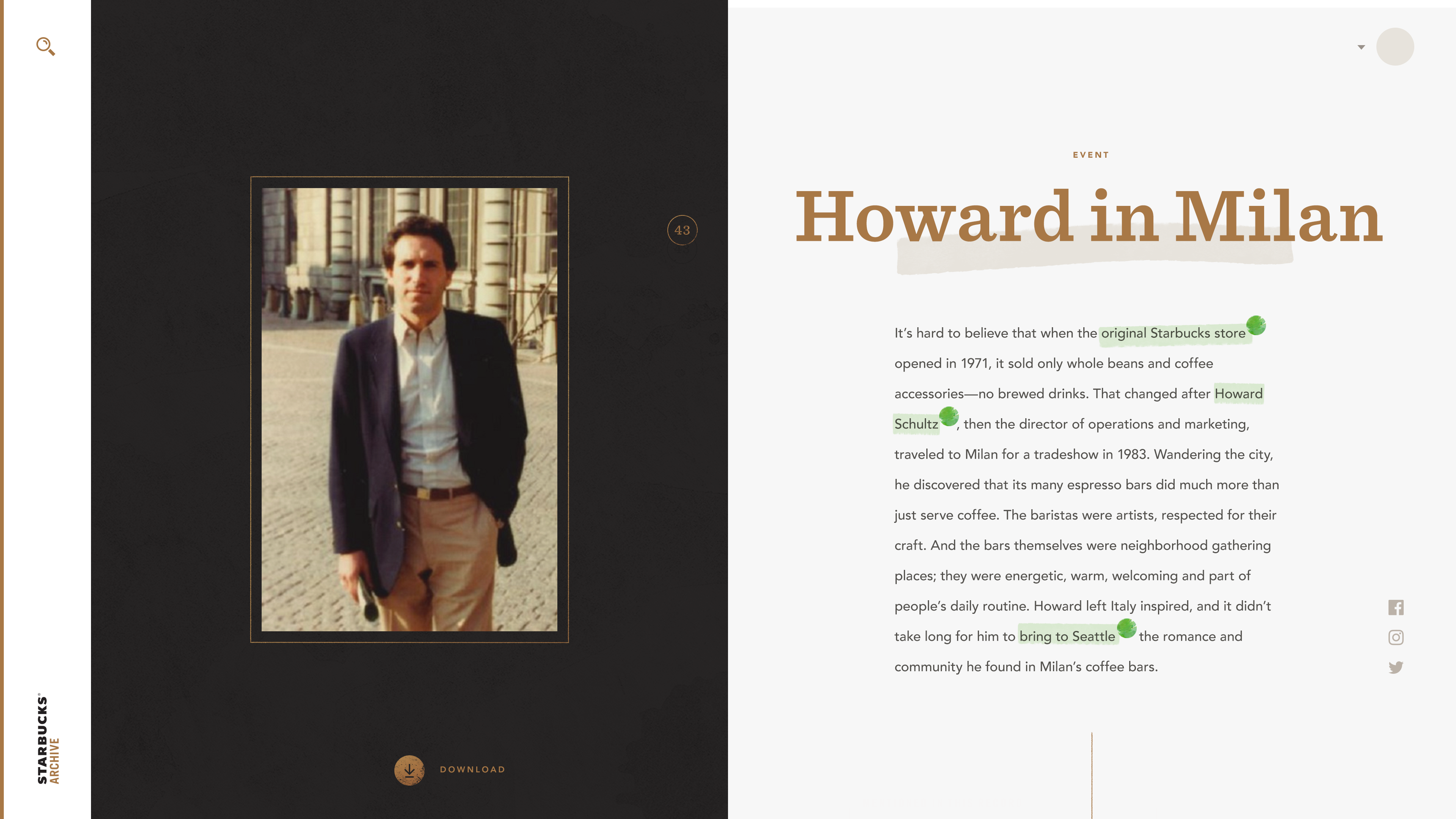
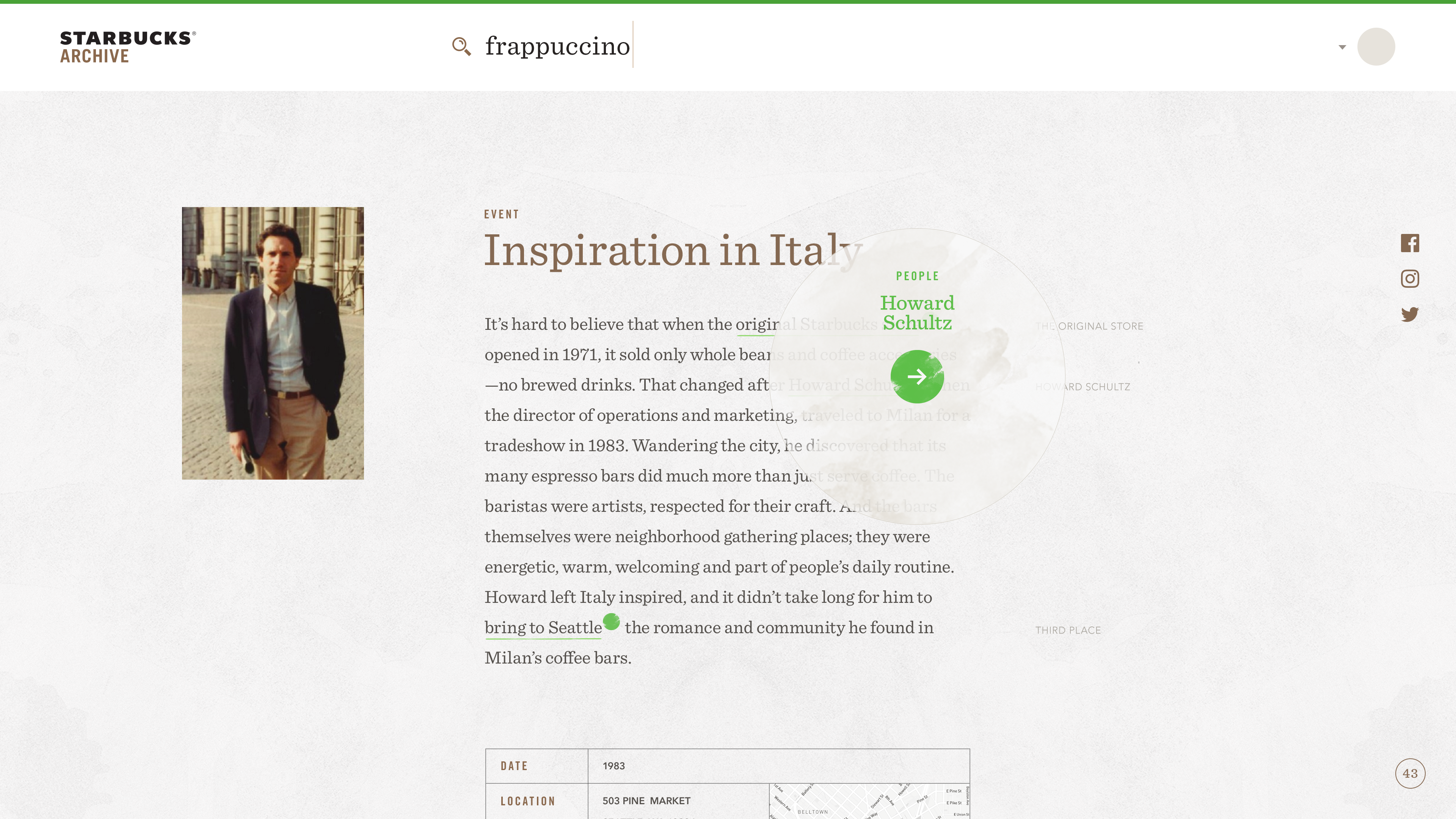
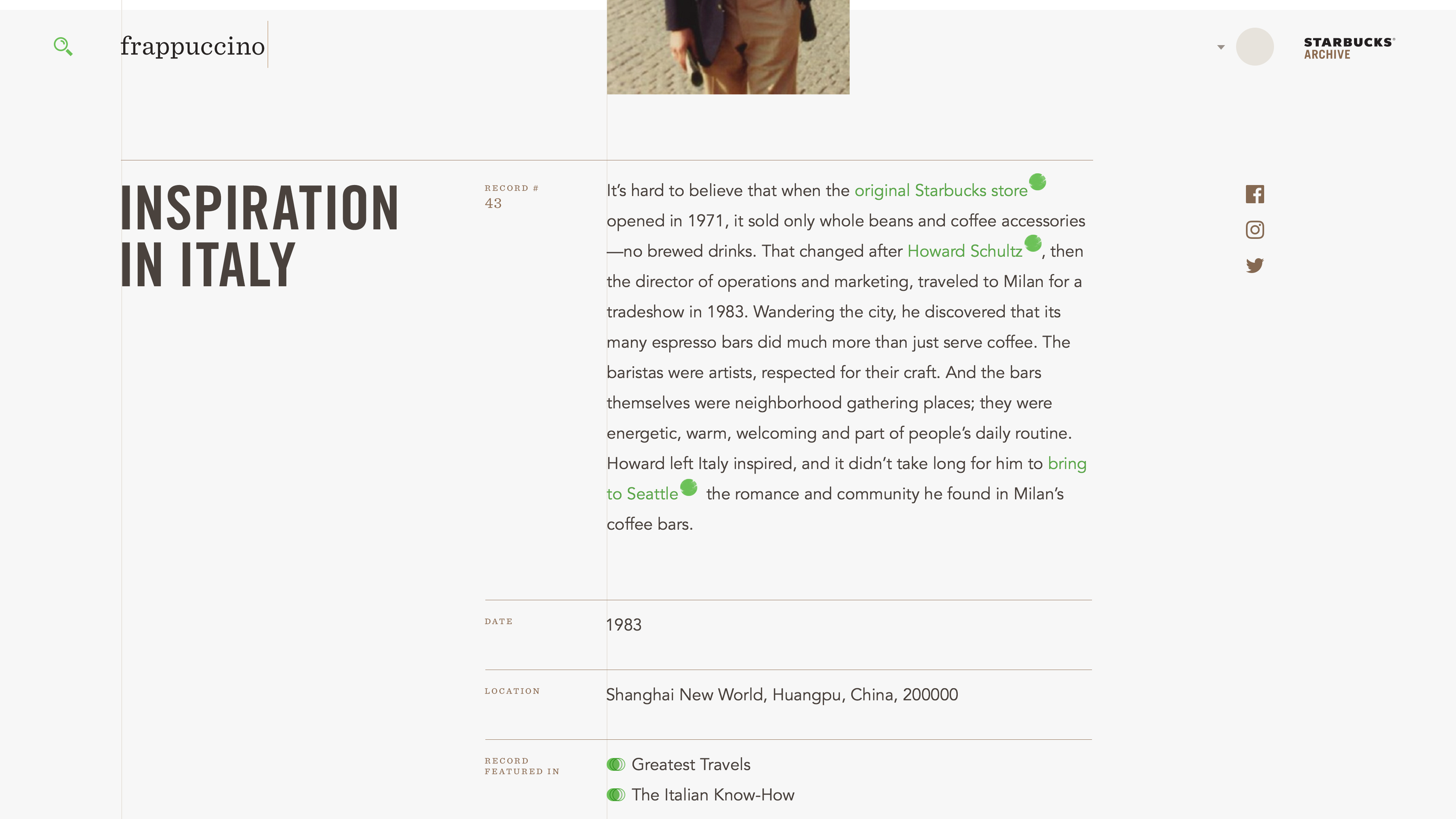
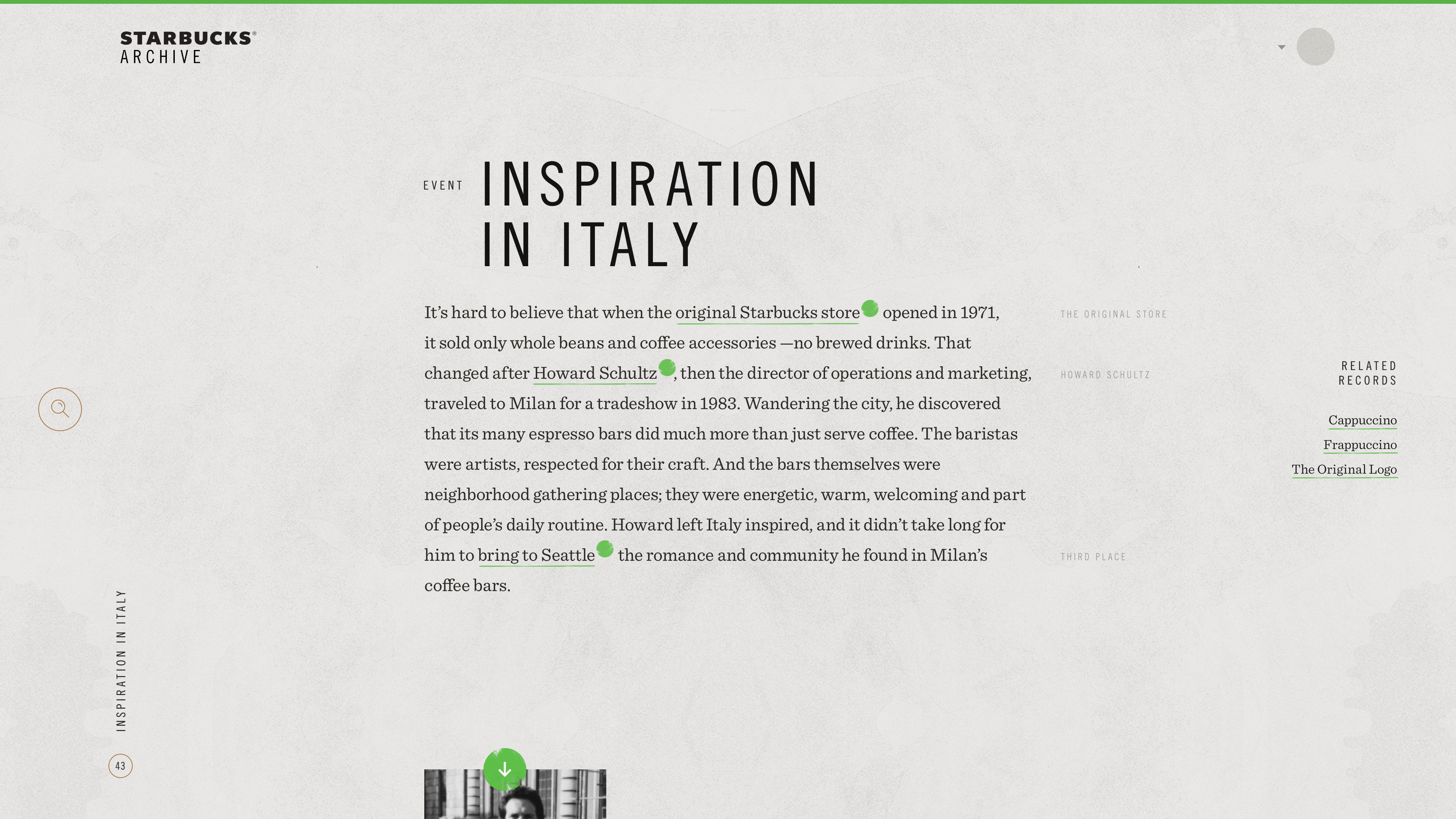
Visual Explorations.